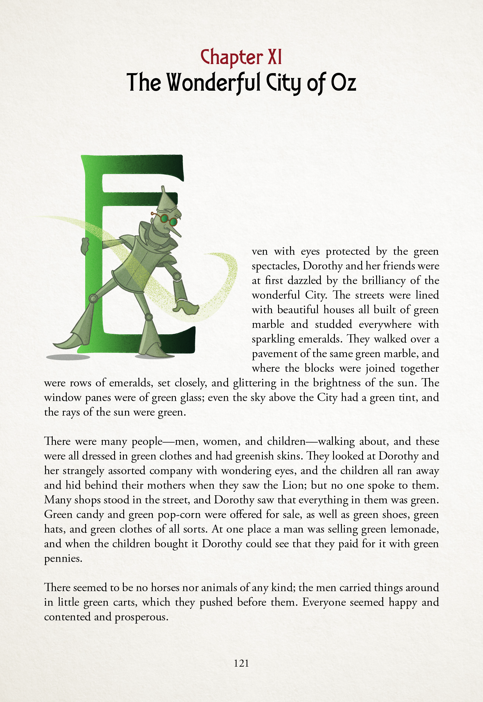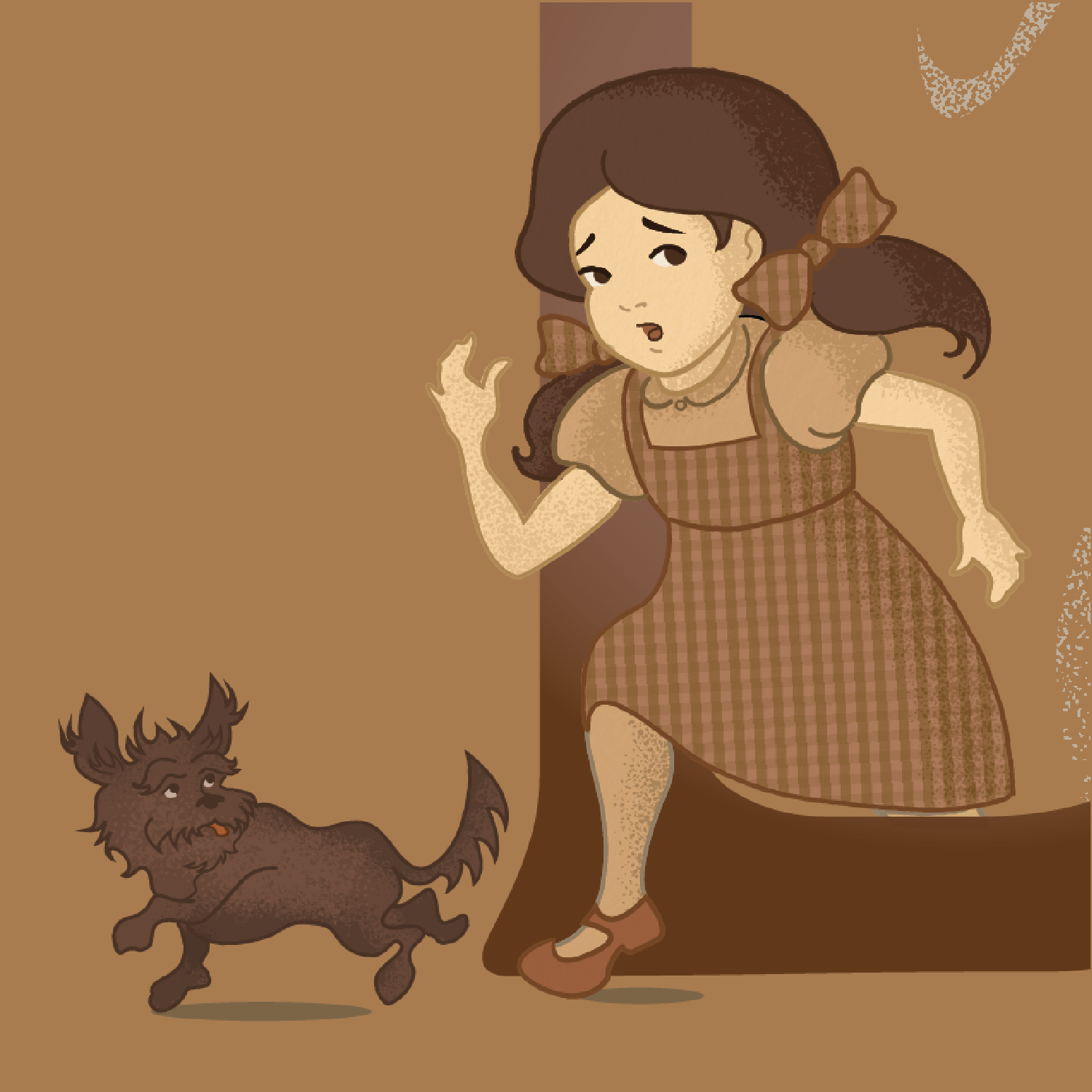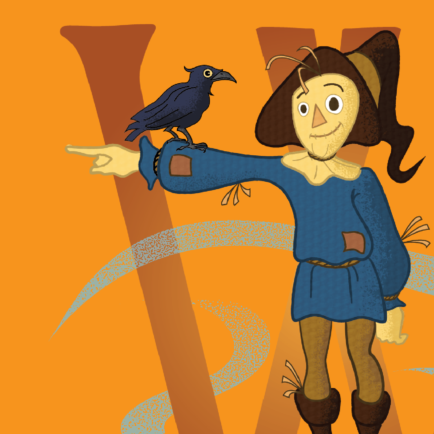
ILLUSTRATED DROP CAPS
research
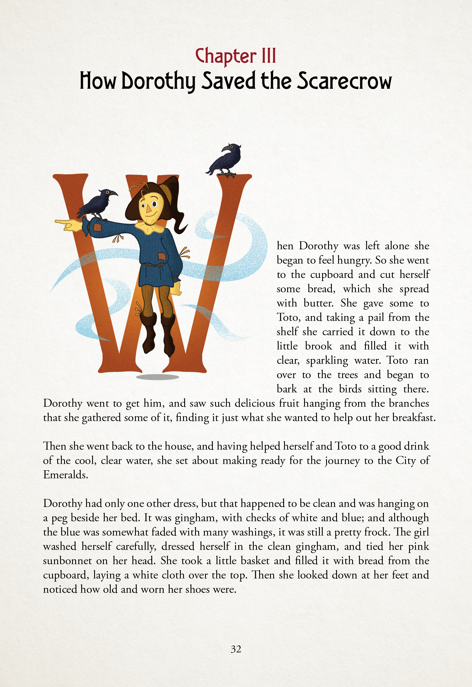
L. Frank’s Baum The Wonderful Wizard of Oz is a body of literature that need no introduction. From its timeless story to its iconic characters, it was important to capture the integrities of Baum’s vision throughout the drop cap’s design.
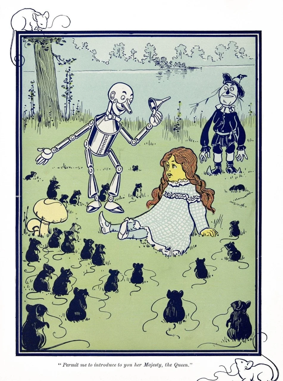
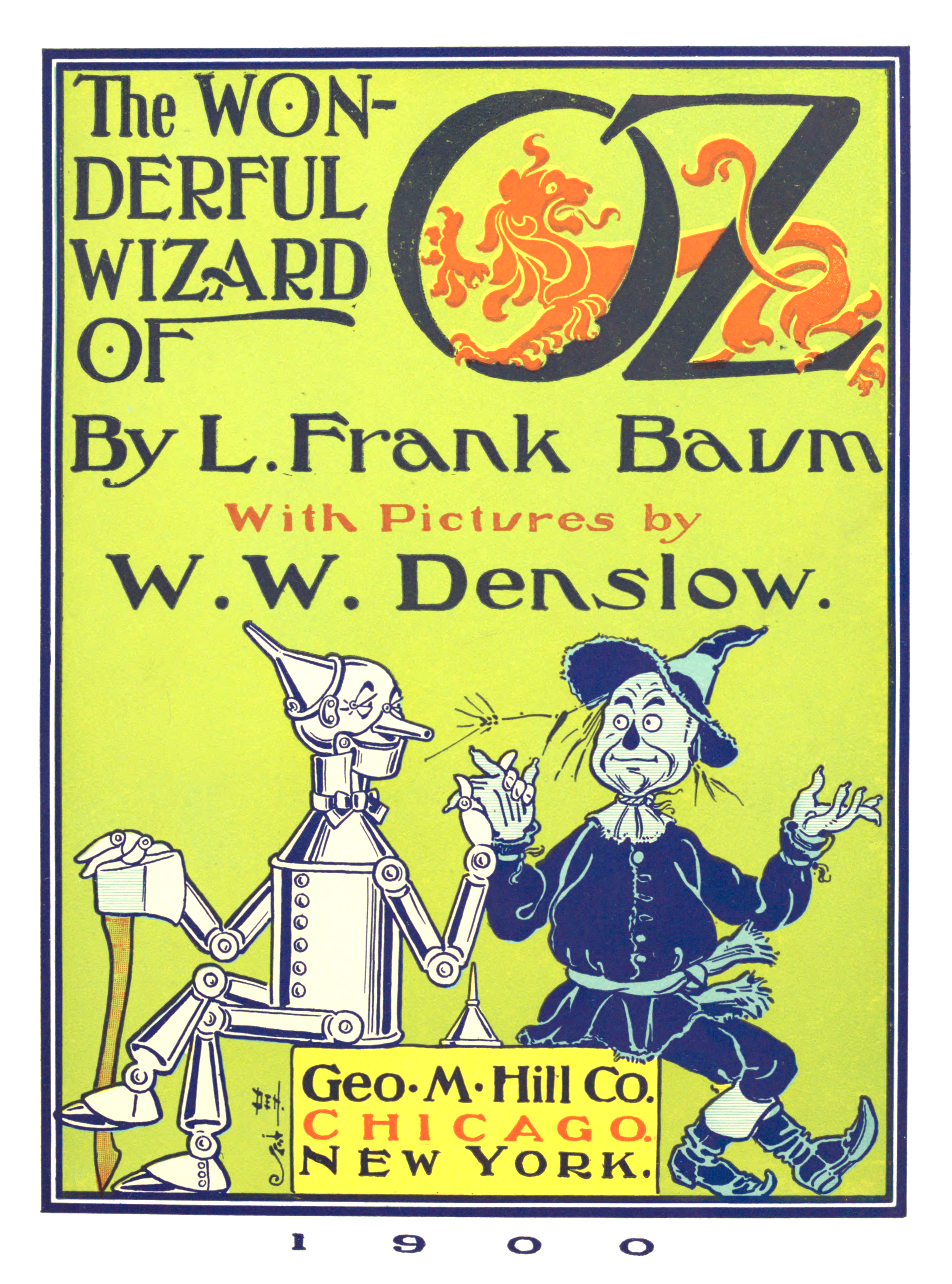
While the book’s imagery has had various interpretations, most famously from illustrations done by W. W. Denslow and the 1939 film starring Judy Garland, I wanted to reimagine the characters in a new way that would remain true to the source material while presenting itself as a unique iteration.
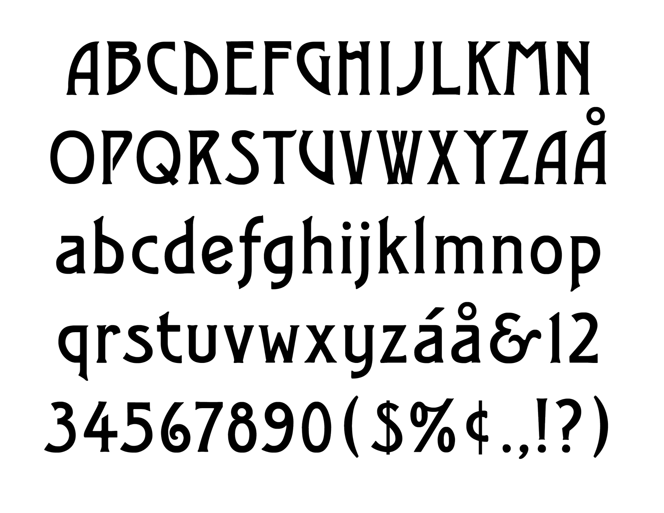
Published in 1900, it was important to reference the typography that existed during that period. Typefaces at the turn of the 20th century were heavily influenced by the Art Nouveau movement in Europe, often with embellished serifs and delicate curves. The selected typeface for the drop cap was Quaint Gothic, based on the Quaint Series from the Dickinson Type Foundry in Boston USA circa 1900.
With its bold forms and minimalistic serifs, the typeface was distinguished enough to intertwine illustrative treatments while simultaneously being legible enough for the reader.


